Scheduling and simulation
The scheduler is intended for scheduling equipment operation, taking into account:
-
Target values for production volumes and ore quality
-
Sequences of the mine technological cycle
-
Duration of operations performed by the selected equipment
-
Lengths of the hauling distances, geometric distance of the stopes
-
Equipment operating schedules
-
Scheduled equipment repairs and other routine maintenance
-
Blasting schedules.
The simulation model checks the feasibility of the scheduler’s plan, taking into account:
-
Unscheduled repairs (failures)
-
Delays due to vehicles passing in busy areas of the mine
-
Loading queues
-
Unloading queues in front of the ore passes due to erratic loading on them
-
Decreased throughput of in-mine haulage due to uneven ore supply
In MineTwin scheduling mode, one shift scheduling and simulation is performed sequentially. At the end of the shift, the scheduler performs scheduling for the next one based on the results of the execution of the previous shift plan by the simulation model.
Simulation management
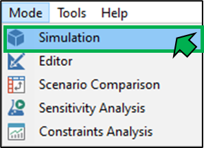
You can switch to planning/modeling mode by selecting Simulation in the Mode menu or by clicking the Simulate button on the toolbar.

To start the simulation, use the  button on the top toolbar of the scheduling module window.
To pause the model, use the button  .
.
To create a stop at the desired simulation time, use the  button.

When you click this button, a window appears where you can specify after how many simulation hours, at what simulation time (in hours), or at what simulation date and time the simulation should stop. When one of these parameters is set, the others are recalculated automatically.
When you click Schedule Stop, the stop is created, the window closes, and the simulation resumes.
To create multiple stops, you can use the technical mode Manage engine events…, which is opened by clicking the corresponding button.
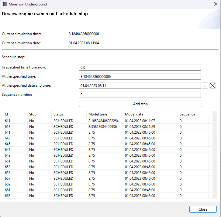
In this mode, stops are created by clicking Add Stop and are displayed in the table below, where you can see both the stops you created (value in the Stop column — Yes) and other system events (value in the Stop column — No).
The Sequence number field defines the order in which the system processes events that occur at the same time.
To exit the stop-creation mode, click Close.
To accelerate/slow down the simulation, use the buttons  .
.
For maximum acceleration, use the button  .
.
Visualization of simulation results
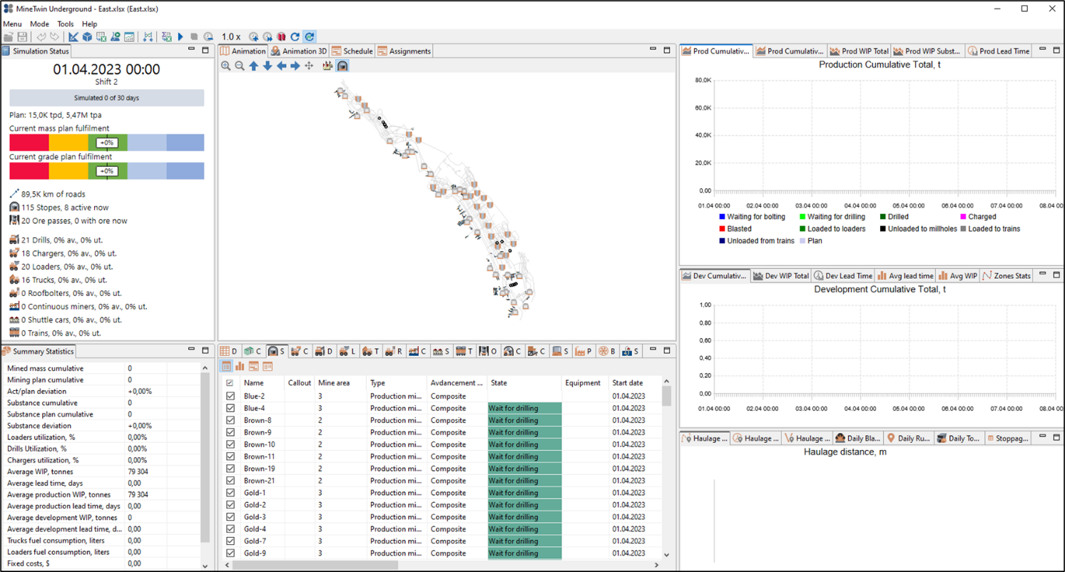
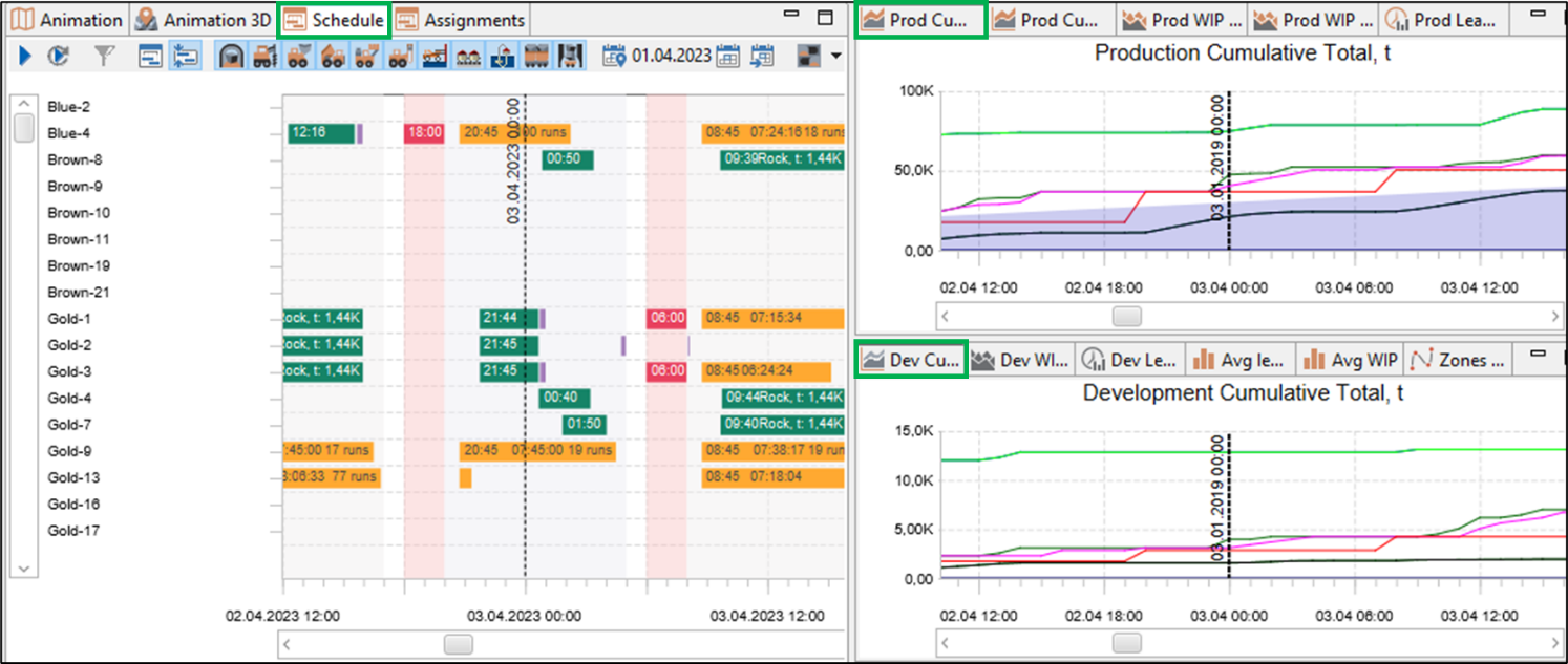
The layout of the simulation window is shown in the figure below.
Animation
2D animation dynamically displays the simulation process in 2D space: simulation of the movement and equipment/transport operation on the mine map.
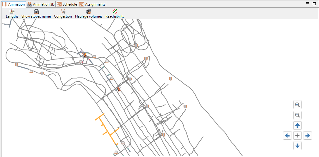
In the lower-right corner of the Animation window, there are buttons that make working with the map easier.
The buttons  allow users to zoom in and out, and the buttons
  allow you to pan the map. The button
  centers the map so that the entire mine is visible at once.
The top toolbar of the animation window contains buttons that control the display of additional information.
The  button shows the lengths of the minefield segments, and the
  button displays the names of the stopes on the map.
The  button highlights road sections where vehicles move slower than their potential maximum speed due to congestion, slopes, or surface conditions.
The color varies for each section:
button highlights road sections where vehicles move slower than their potential maximum speed due to congestion, slopes, or surface conditions.
The color varies for each section:
-
Red — equipment is slowed down — the section is overloaded or problematic;
-
Green — equipment moves freely — the section is functioning normally.
-
Gray indicates that there is no data (no vehicles passed over this section during the selected period).
The  button highlights route load based on the haulage volume of ore mass transported by loaders/trucks.
The  button highlights connected graphs of the transport network. The disconnected segments will be shown with different color.
Clicking on the equipment unit opens a window with information about the status of the equipment unit, its availability and equipment utilization.
Clicking on a stope opens a window with information about the status of the stope, the quality and density of the ore mass in the stope.
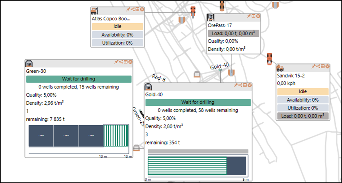
Clicking on the dump area, its loading, quality and density of the ore mass at the dump area are displayed.
The button  in the information window closes the window.
The button  activates the table with the list of equipment units and highlights the selected unit.
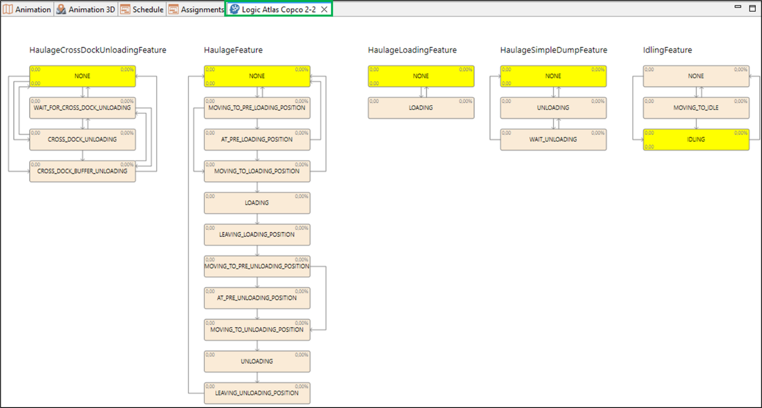
The button  activates the technical state-chart table, which can be used for model debugging.
The button  pins the information window to the map, allowing it to move together with the map.
Animation 3D
3D animation dynamically displays the simulation process in 3D space: simulation of the movement and equipment/transport operation on the mine 3D map.
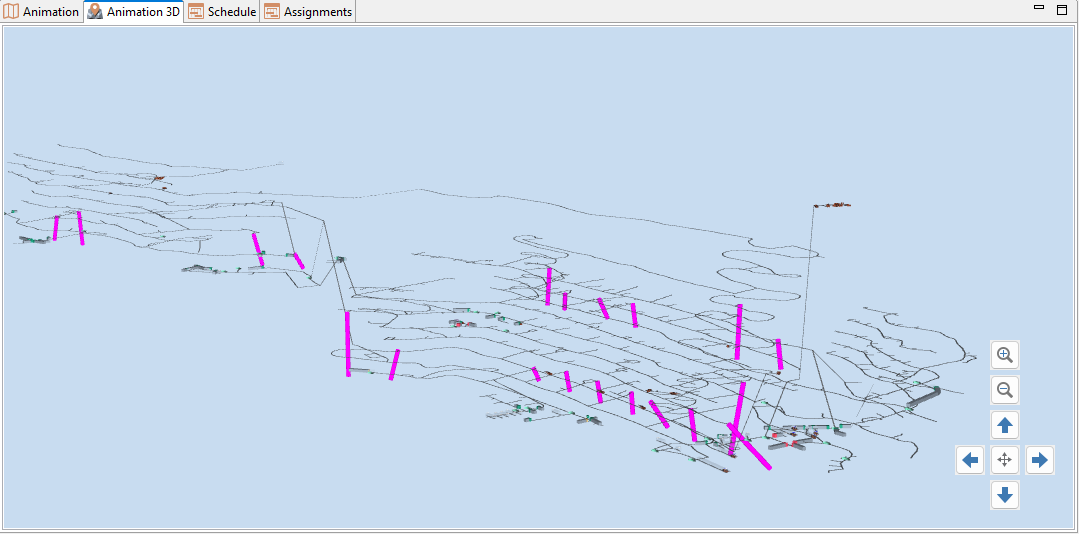
Clicking on the equipment unit opens a window with the name of the equipment unit.
In the lower-right corner of the 3D Map window, there are buttons that make working with the map easier.
The button centers the map so that the entire mine is visible at once.
The buttons allow you to zoom the map in and out, and the buttons allow you to pan the map.
Schedule
In the Schedule window of the simulation mode, the Gantt chart displays planned states for the stopes (drilling, charging, blasting, hauling, etc.), and planned tasks for the equipment. As the simulation runs, the execution of the plan is shown dynamically: both adherence to the planned schedule and any deviations from it. image::image172.png[Gantt chart displaying equipment schedules with color-coded tasks and time allocations on 01.04.2023 and 03.04.2023.,width=656,height=306]
To start the simulation, use the button on the top toolbar of the Schedule window.
The simulation can be restarted to the desired simulation time. To do this, place the vertical time marker at the desired date and click the  button.
You can make the elements in the Schedule view larger using the  button (Normal mode) or more compact using the
  button (Compact mode).
By clicking the buttons with equipment type icons, the Gantt chart will display only the equipment of the selected types. The button  allows you to display only the stopes of the selected mine area and the equipment operating in the selected mine area.
A group of buttons  allows you to display the schedule for a specific date. The button
  enables this mode, the button
  lets you to select the date, the button
  scales the Gantt chart so that only the schedule for the specified date is shown.
Assignments
The Assignments table contains a list of all operations performed by the equipment. For each operation, the following information is shown:
-
Start and end time of the operation
-
Shift number in which the operation was completed
-
The duration of the operation
-
The stope where the operation was performed
-
The mine area to which the stope belongs
-
Equipment that performed the operation
-
The work volume completed (number of drilled/charged holes, number of trips, amount of hauled rock mass, etc.)
-
Final offset, m — the distance from the start of the stope at which the operation ended
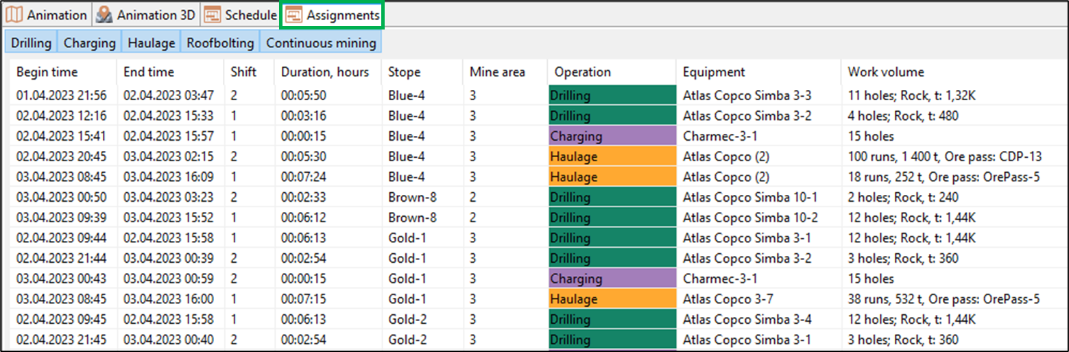
The user can choose to display only specific types of tasks in the table by clicking the corresponding buttons in the top toolbar of the Assignments window: drilling, charging, hauling, roofbolting, continuous mining, and scaling.
Statistical information
Simulation status
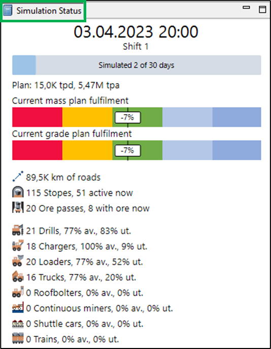
On the left side of the Simulation view, there is the Simulation Status panel, which displays general information about the progress of the simulation experiment:
-
Current model date and time
-
Current shift number
-
Number of simulated days
-
Daily and annual production targets
-
Percentage of production target achieved by mass
-
Percentage of production target achieved by ore grade
-
Total length of roads in km
-
Total number of stopes in the scenario and the number currently active
-
Number of ore passes and number of ore passes containing ore
-
Number of equipment units, their availability (av.) and utilization rate (ut.).
Summary statistics
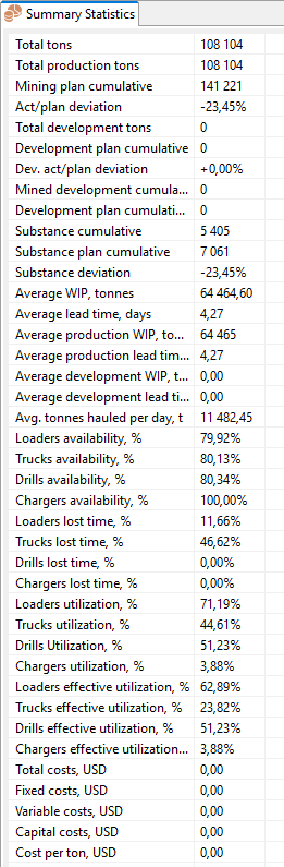
The Summary statistics table displays the key statistical indicators of the simulation results:
-
Total amount of mined ore mass, t
-
Cumulative amount of mined production tons
-
Planned cumulative ore production, t
-
Deviation from the ore production plan, %
-
Cumulative amount of development tons
-
Development plan cumulative, t
-
Deviation from the development plan, %
-
Cumulative amount of development m3
-
Development plan cumulative, m3
-
Substance cumulative, t
-
Substance plan cumulative, t
-
Substance deviation from the plan, %
-
Average WIP in total and separately for production and development, t: average amount of material (ore, rock, etc.) between some two stages of mining. For example, the WIP of drilling is the amount of material for which drilling has started but has not been charged
-
Average lead time in total and separately for production and development, days: the time required to mine a conditional ton of ore mass from drilling to haul on top
-
Average daily production, t
-
Availability and downtime share for LHDs, trucks, drill rigs, and charging machines, %
-
Equipment utilization (UR) and effective UR by equipment type, %
-
Total costs and separately fixed, variable, and capital costs, in USD
-
Cost per ton, in USD
Daily volume stats
The Daily Volume Stats table shows the daily volumes of ore mass at different stages of its production:
-
Reached ore mass (ore mass in stopes, access to which is open)
-
Drilled ore mass
-
Blasted ore mass
-
Ore mass loaded to loaders
-
Ore mass is unloaded by loaders and trucks to the ore passes
-
Ore mass loaded to trains
-
Ore mass unloaded from trains to the ore passes
It also displays production indicators such as:
-
Daily planned ore mass production
-
Deviation of the simulated production volume from the plan
-
Simulated daily ore quality (percentage of substance)
-
Planned daily ore quality (percentage of substance)
-
Deviation of simulated ore quality from the plan
-
Total number of drilled holes, and separately vertical and horizontal holes drilled
-
Number of LHD/truck runs per day
-
Daily haulage volume in tonne-kilometers
-
Simulated cumulative ore mass production
-
Planned cumulative ore mass production
-
Simulated cumulative substance production
-
Planned cumulative substance production
-
Deviation from the substance production plan
-
Number of blasts
-
Number of roof bolts installed
-
Total meters of installed rooof bolts
-
Total length of advancement, m

Daily outputs by mine areas
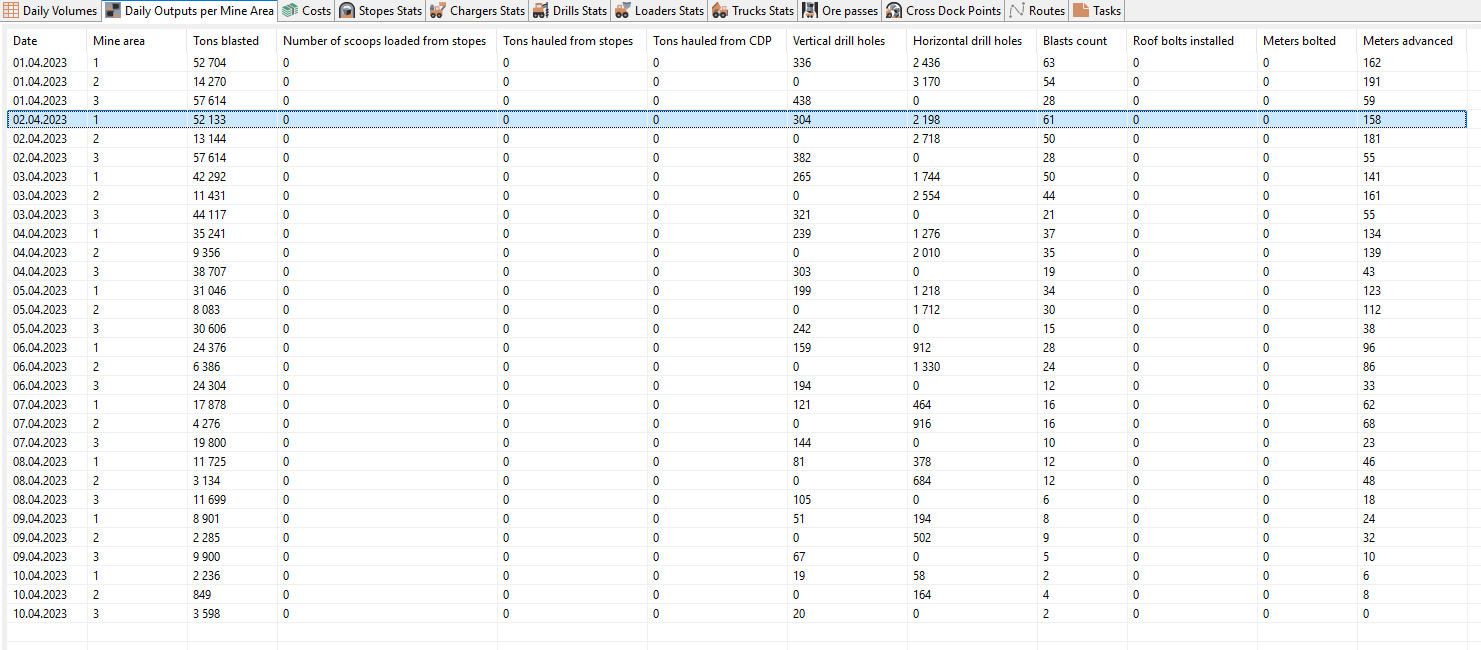
The Daily outputs by mine areas table provides detailed daily statistics for mine areas:
-
Amount of blasted rock mass, t
-
Number of scoops loaded from stopes
-
Amount of ore mass hauled out of the stopes, t
-
Amount of ore mass hauled from Cross-Dock Points (CDP), t
-
Number of drilled vertical holes
-
Number of drilled horizontal holes
-
Number of blasts
-
Number of roof bolts installed
-
Total meters of installed roof bolts
-
Total length of advancement, m
Costs
The Costs table contains information about costs by types of costs and types of equipment.
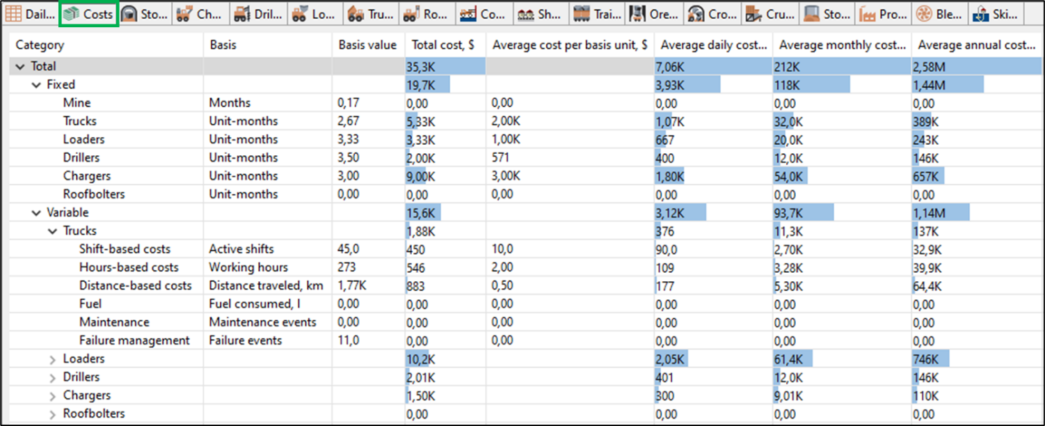
The table displays:
-
Fixed costs total and by type of equipment
-
Number of used equipment-months by types of equipment
-
Average costs per equipment unit by type for the entire simulation period/ average per day, average monthly/ average annual
-
-
Variable costs by types of equipment with breakdown:
-
Shift-based costs
-
Hours-based costs
-
Distance-based costs
-
Fuel
-
Maintenance
-
Failure management
-
-
Capital costs total and by type of equipment
Stopes stats
The Stopes stats table shows data on the state of stopes at each moment.
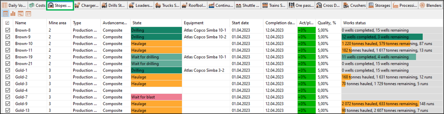
The following is shown for each stope:
-
Mine area to which the stope belongs
-
Type (production or development)
-
Advancement Type (excavation, cleaning, etc.)
-
Current state of the stope (wait for drilling, drilling, wait for charging, charging, etc.)
-
Start and completion date
-
Duration of state
-
Simulated amount of removed ore mass in tons
-
Number of drilled vertical hole-meters
-
Number of drilled horizontal hole-meters
-
Total advancement length of the stopes, m
-
Amount of remaining ore mass in tonnes and m³
-
Planned ore mass to be removed, t
-
Percentage deviation from the plan
-
Ore mass quality in the stope (substance grade)
-
Ore mass density in the stope
-
Work status: volume of completed and remaining work in the stope (number of drilled and remaining holes, tonnes of hauled and remaining rock mass, etc.)
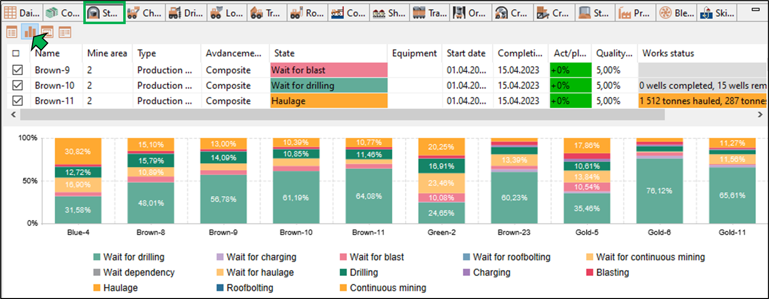
The button  in the upper right corner of the table opens the bar chart of stopes stats.
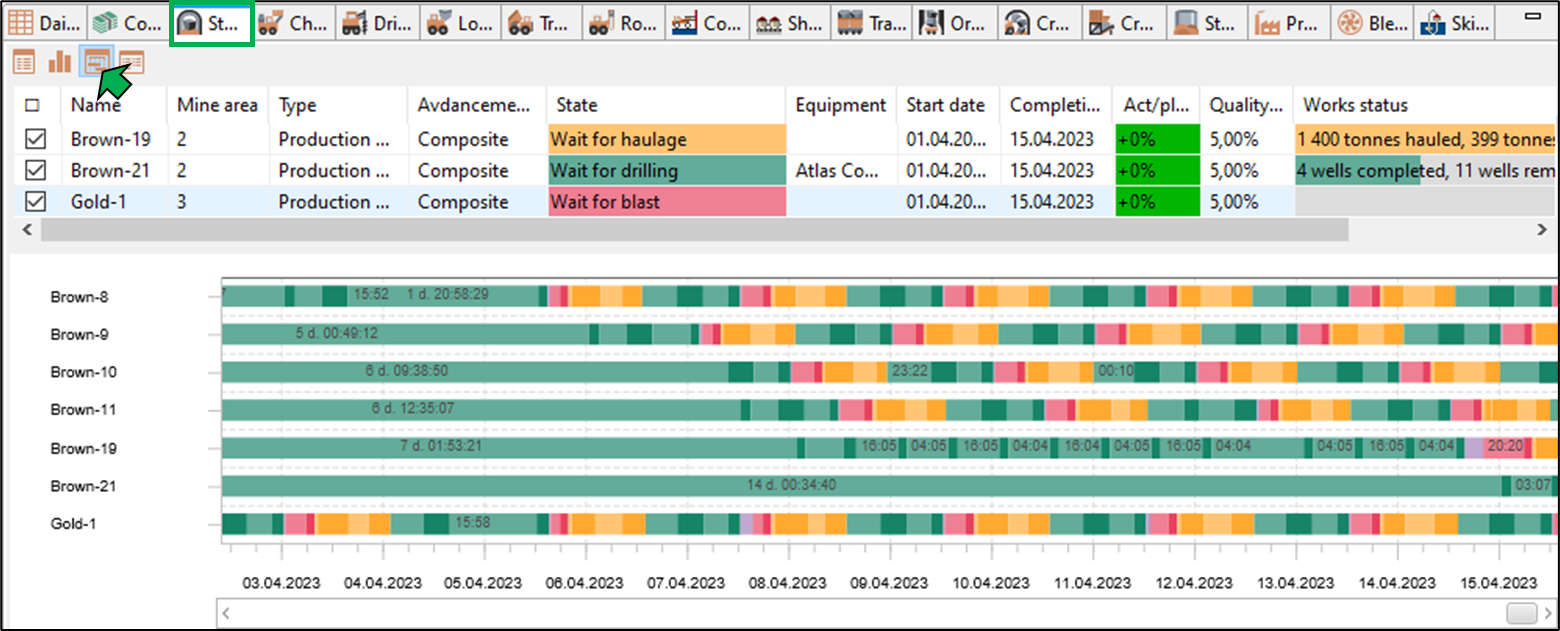
The button  in the upper right corner of the table opens the Gantt chart of stopes statistics.
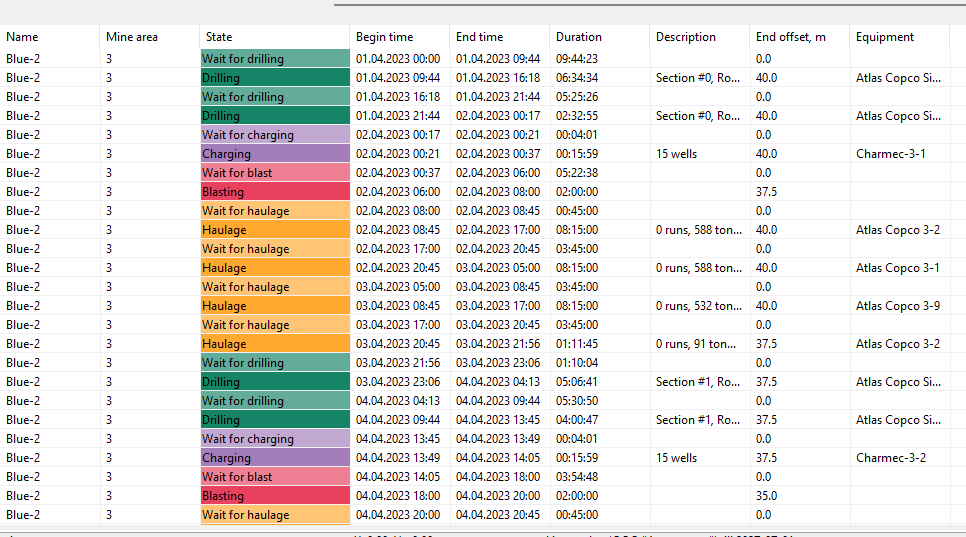
Clicking the  button in the upper-right corner of the table opens a table with detailed information on stope states for the entire simulation period.
Equipment stats
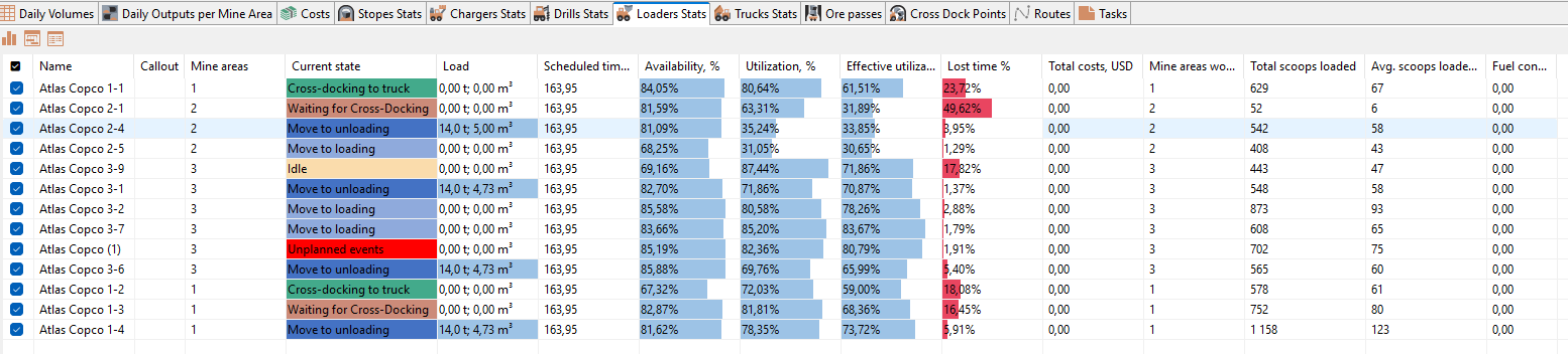
Separate tables are provided for each equipment type, displaying the status and general information for all equipment units, including:
-
The mine area to which the equipment unit is assigned
-
Current state (moving, performing a task, idle, etc.)
-
Equipment availability, % – the ratio of time during which the equipment was available for work (according to the schedule and planned downtime) to the total in-shift time. For example, an LHD operates two 10-hour shifts. Its in-shift time is 20 hours. Each shift includes a 0.5-hour lunch break, and at the start of the first shift it has 2 hours of planned maintenance. Thus, the available time for the LHD on that day is: 20 − 0.5×2 − 2 = 17 hours, and availability is 17/20 = 85%.
-
Equipment utilization rate, % – the ratio of time during which the equipment performed tasks to the total in-shift time. For example, the LHD operated for: 5 hours of travel, 3 hours of loading, 2 hours of unloading, and 1 hour waiting in queue at the ore pass. Total productive time 5 + 3 + 2 + 1 = 11 hours, so UR 11/20 = 55%.
-
Effective utilization rate, % – utilization excluding non-productive time. In the previous example: productive time excluding queue waiting 11 − 1 = 10 hours, so effective UR 10/20 = 50%.
-
Lost time, % – the ratio of non-productive time to total task execution time. In the example: productive time 11 hours, "lost" queue time 1 hour → downtime share 1/11 = 9%.
-
Costs for the equipment unit, USD
-
List of mine areas in which the equipment unit operated during the simulation
-
Additional information specific for each equipment type like Total scoops loaded, Drilled wells etc.
-
Duel consumption by the unit, l
An example table for LHDs is shown below:
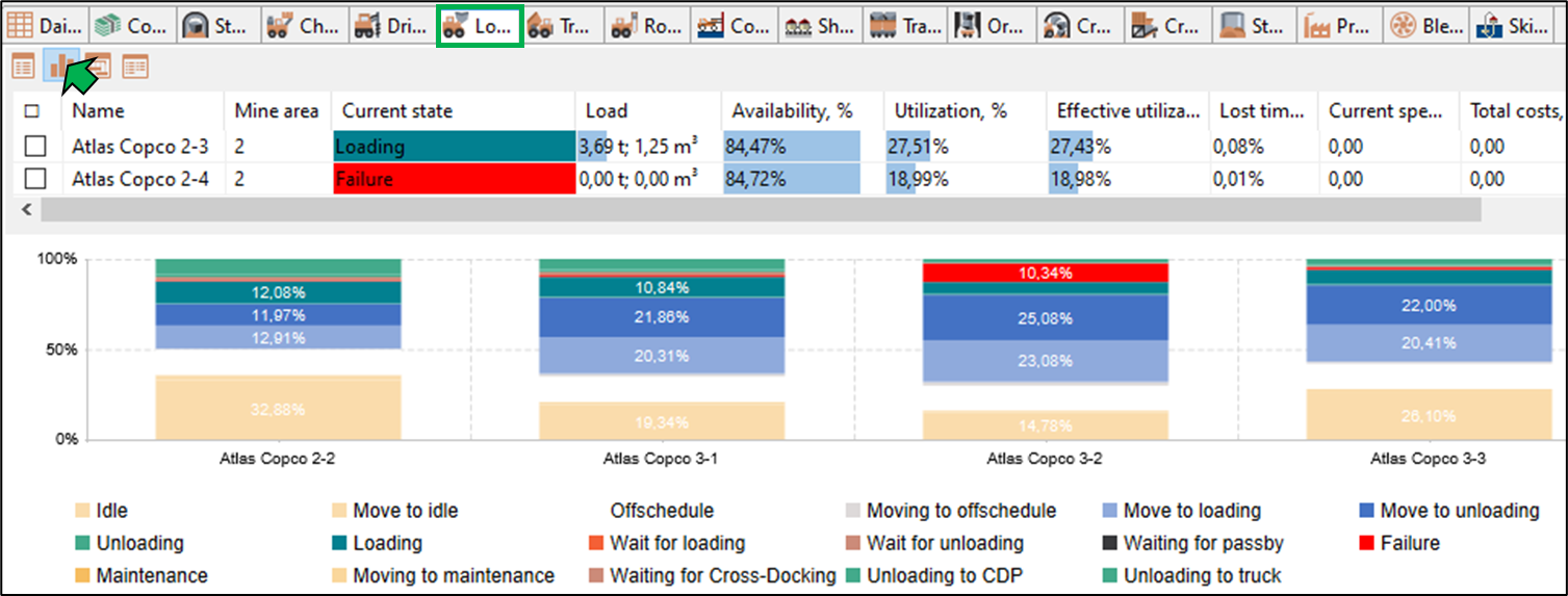
Clicking the button in the upper-right corner of the table opens the bar-chart view of equipment statistics.
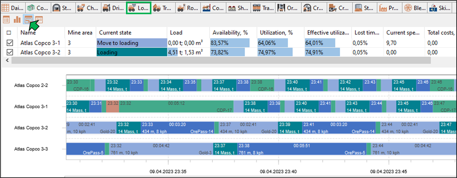
Clicking the button opens the Gantt chart of equipment operations.
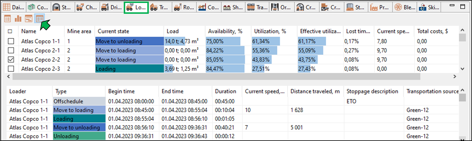
Clicking the  button opens a table with detailed information on equipment states for the entire simulation.
Ore storage locations
In separate tables for ore passes, cross-dock points and storages information about their current states is displayed, such as fill level, ore types, ore quality, and more.
An example table showing ore pass states is presented below:
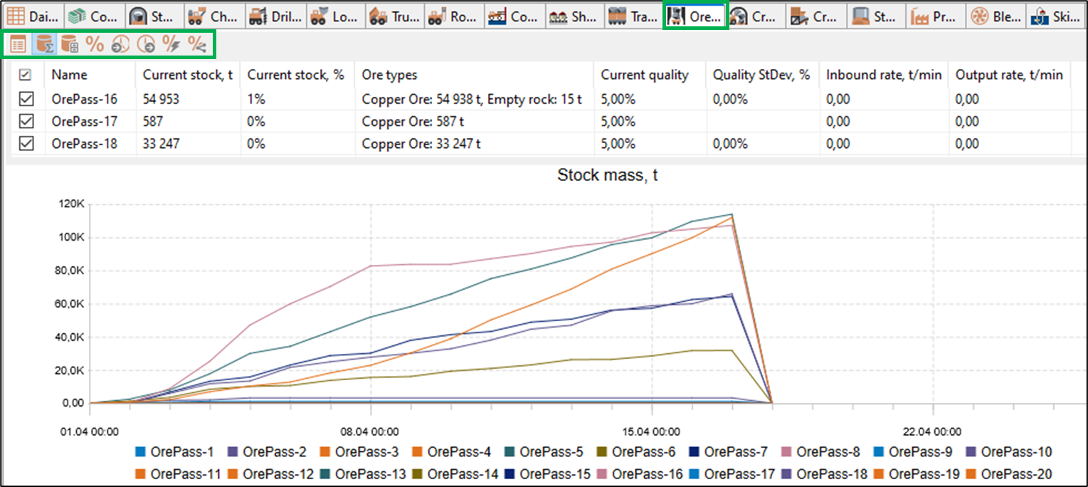
For each ore pass, the following information is shown:
-
Callout — allows you to display callout window for selected object
-
Mine area to which the ore pass belongs
-
Capacity, t
-
Current stock, in tonnes and as % of capacity
-
Amount of ore types contained in the ore pass by type
-
Current ore quality in the ore pass, %
-
Standard deviation of ore quality (StDev), %
-
Inbound rate of ore mass into the ore pass, t/min
-
Output rate of ore mass from the ore pass, t/min
The buttons on the toolbar of the Ore Passes window open individual charts showing:
-
Ore mass stock in ore passes, in tons
-
Volume of ore mass stock in ore passes, in m3
-
Change in the quality of the ore mass, in %
-
Rate of ore mass entering the ore pass, t/min
-
Output rate of ore mass from the ore pass, t/min.
-
Changes in the quality of ore fragments, %
-
Variability of the content of useful substances by processing stages, %.
Routes
The Routes table displays the following data for each route:
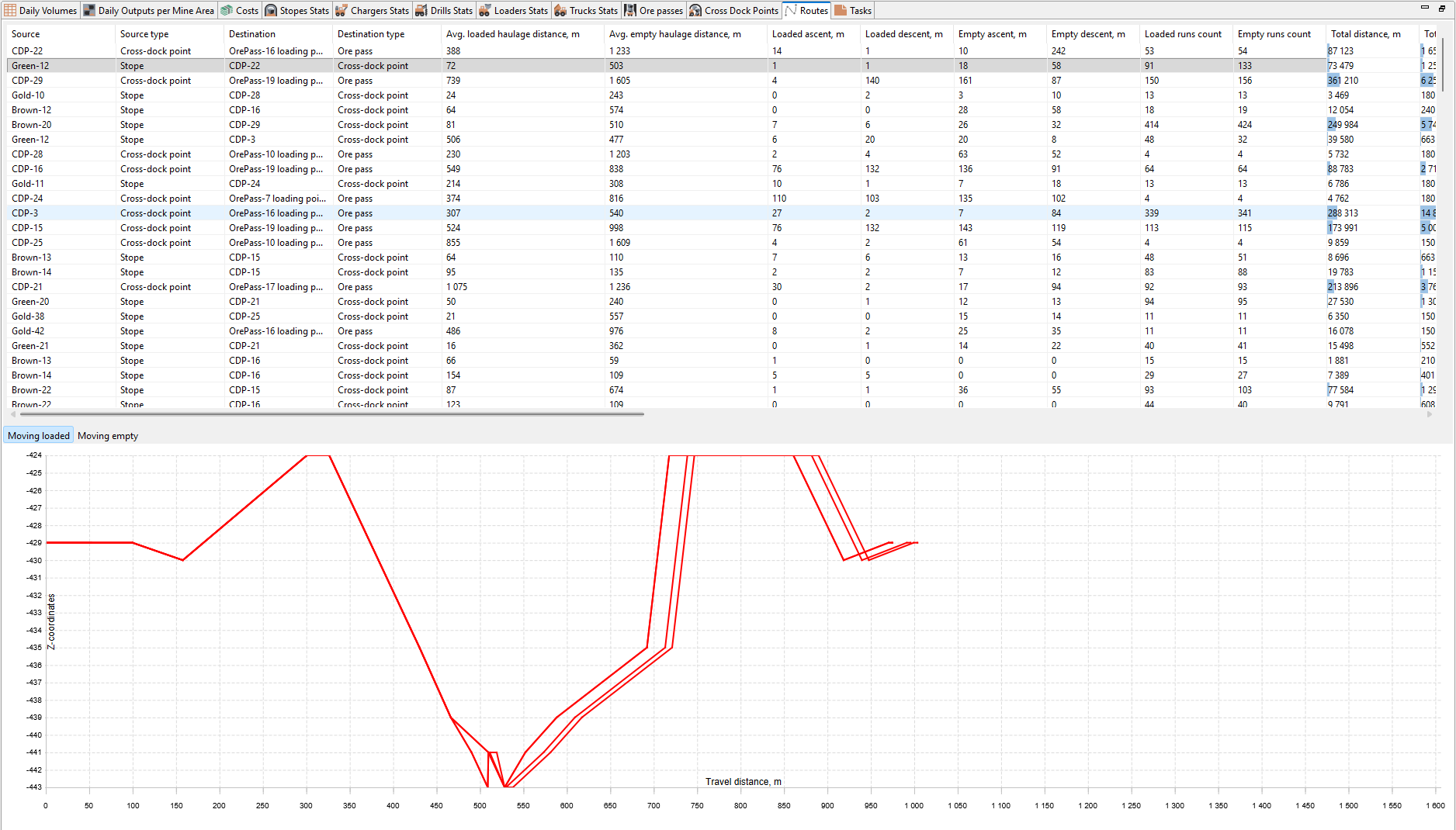
-
Source and Destination for the route, and its types
-
Average haul distance loaded/empty, m
-
Ascent loaded/empty, m
-
Descent loaded/empty, m
-
Number of loaded trips / return trips
-
Total distance traveled, km
-
Total tonnes hauled
-
Total tonne-kilometers
-
Average travel time loaded/empty, min
-
Average travel speed loaded/empty, km/h
-
Duration of the full loading–hauling–unloading cycle, min
-
Percentage of time spent loading / unloading / waiting
-
Quality of material hauled on the route, %
-
List of equipment types and units that performed trips along the route
For each route a Z-axis profile of the route is displayed for loaded and empty route leg.
Graphs and charts
The MineTwin Underground visualization contains various graphs and charts for analyzing simulation results. By default, they are grouped into three windows on the right side of the screen.
Graphs for analysis of production
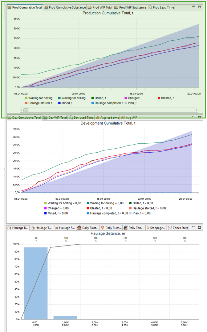
Several graphs in the upper right window are dedicated to the production mining. They are:
Production Cumulative Total Chart
The Production Cumulative Total chart displays the cumulative progress of mining operations over time, showing the total amount of ore mass (in tonnes) that has passed through each stage of the mining cycle.
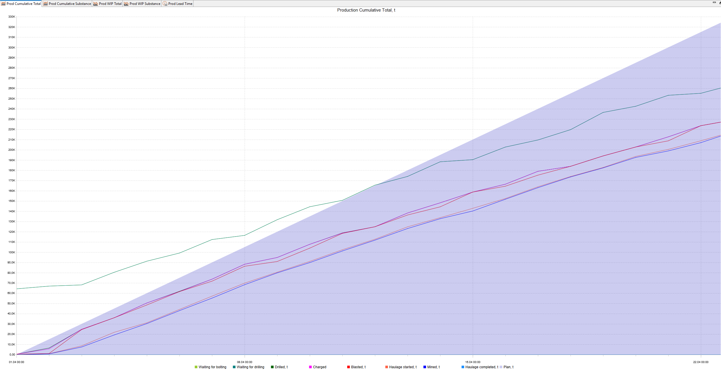
This chart helps track how much ore mass has been reached, bolted, drilled, charged, blasted, hauled, and mined relative to the production plan. It allows users to visually compare actual progress against planned targets.
Chart Elements:
-
X-axis (horizontal): Timeline (dates and times of the simulation)
-
Y-axis (vertical): Cumulative tonnage (t)
Lines and Areas
-
Waiting for bolting, t — ore mass in stopes that have become accessible for bolting
-
Waiting for drilling, t — ore mass in stopes that have become accessible for drilling
-
Drilled, t — ore mass in stopes where drilling has been completed
-
Charged, t — ore mass in stopes where charging has been completed
-
Blasted, t — ore mass in stopes that have been blasted and are ready for hauling
-
Haulage started, t — ore mass currently being hauled
-
Mined, t — ore mass, that was considered as mined
-
Haulage completed, t — ore mass that has been delivered to haulage destinations
-
Plan, t (filled area) — cumulative planned production target
How to Use:
-
Monitor the buildup of tonnage through each stage of the production cycle.
-
Verify that actual production (mined/haulage completed) is following the planned trajectory.
-
Identify bottlenecks: flat lines indicate inactive stages where no progress occurred during the period.
-
Detect delays: if the mined line lags significantly behind the plan area, production is behind schedule.
Production Cumulative Substance Chart
The Production Cumulative Substance chart uses the same logic as Production Cumulative Total chart but for useful material, contained in ore mass.
Production WIP Total Chart
The Production WIP (Work In Progress) Total chart shows the amount of ore mass (in tonnes) that is currently in progress at each stage of the mining cycle over time.
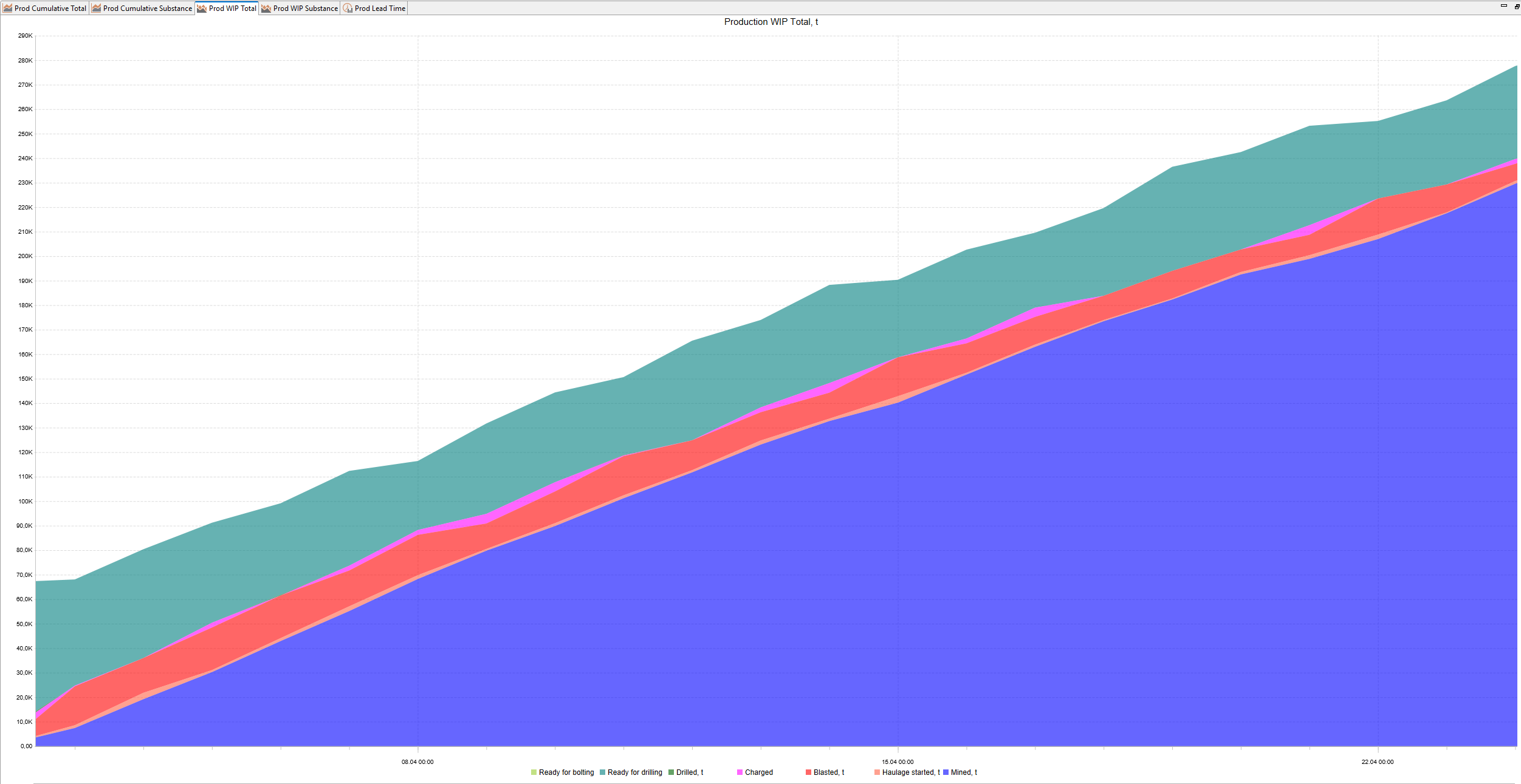
This chart helps analyze where ore mass is “accumulating” in the production process at any given moment. It shows how much ore mass is waiting at each stage — bolted, drilled, charged, blasted, or awaiting haulage — and helps identify production bottlenecks.
Chart Elements:
-
X-axis (horizontal): Timeline (dates and times of the simulation)
-
Y-axis (vertical): Amount of ore mass currently in progress (t)
Stacked Areas:
-
Ready for bolting, t — ore mass in stopes that have become accessible but not yet bolted
-
Ready for drilling, t — ore mass in stopes that have been bolted but not yet drilled
-
Drilled, t — ore mass drilled but not yet charged
-
Charged, t — ore mass charged but not yet blasted
-
Blasted, t — ore mass blasted and awaiting haulage
-
Haulage started, t — ore mass currently being hauled but is not yet considered as mined
-
Mined, t — ore mass that was considered as mined, but which haulage is not yet completed
How to Use:
-
Observe how material flows through different stages and where it accumulates.
-
Detect production bottlenecks — if material builds up in one stage (for example, large red area = blasted but not hauled), it may indicate insufficient equipment capacity at the next stage.
-
Verify process balance — steady material levels at all stages indicate a smooth production flow, while sharp spikes or drops show interruptions.
-
Monitor the depletion of blasted material as it is gradually hauled away.
Production WIP Substance Chart
The Production WIP Substance chart uses the same logic as Production WIP Total chart but for useful material, contained in ore mass.
Production Lead Time Chart
The Production Lead Time chart shows how long ore mass (in days) spends in each stage of the mining process, calculated as how many days ore mass is staying in its current stage of the mining process at each point of time.
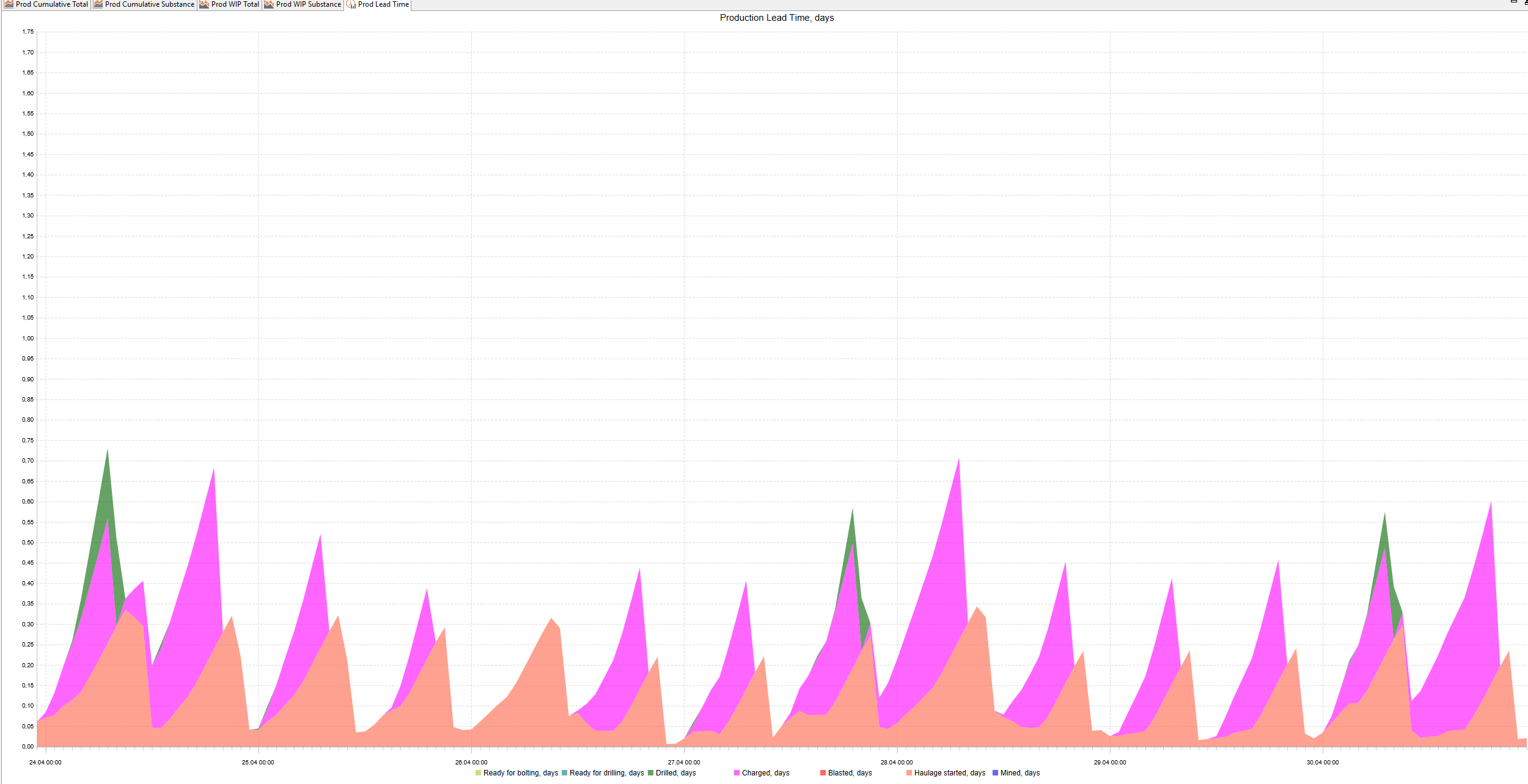
This chart helps analyze the overall efficiency of the production chain by showing how much time it takes for ore mass to pass through each stage — from becoming accessible to being hauled to the final destination. It helps identify delays or bottlenecks that increase the total cycle time.
Chart Elements:
-
X-axis (horizontal): Timeline (dates and times of the simulation)
-
Y-axis (vertical): Lead time in days
Stacked Areas (lead time contribution by stage):
-
Ready for bolting, d — time ore mass spends between becoming accessible and bolting start
-
Ready for drilling, d — time ore mass spends between becoming bolted and drilling start
-
Drilled, d — time ore mass spends between drilling and charging
-
Charged, d — time between charging and blasting
-
Blasted, d — time between blasting and the start of haulage
-
Haulage started, d — time from haulage start to being considered as mined
-
Mined, d — time from being considered as mined to being hauled to the final destination
How to Use:
-
Evaluate the total production cycle time: higher values indicate slower throughput.
-
Identify stages that contribute most to delays — the thickest colored areas show where ore mass spends the most time.
-
Track how lead time changes over the simulation period:
-
A growing slope means lead times are increasing (process is slowing down).
-
A declining or stable slope means throughput is improving or stable.
-
-
Use this chart alongside the WIP and Cumulative Total charts to link time delays to ore mass accumulations.
Charts for analyzing development mining
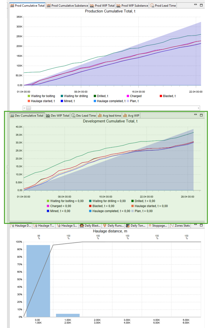
In the middle right window there are 3 charts for development mining:
-
Development cumulative total
-
Development WIP total
-
Development lead time
They have the same logic as corresponding charts for production mining.
Also, there are 2 bar graphs for averages:
-
Average lead time
-
Average WIP
Average lead time
This chart shows average lead time (in days) for different stages of the mining cycle, broken down into three categories: Summary, Production, and Development.
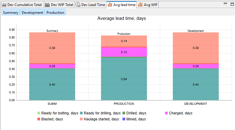
Chart Elements:
Each column is a stacked bar, where the total height represents the total average lead time, and each colored segment represents the duration of a specific stage:
-
Ready for bolt installation, days
-
Ready for drilling, days
-
Drilled, days
-
Charged, days
-
Blasted, days
-
Haulage started, days
-
Mined, days
How to Use:
This visualization helps compare how different stages impact the total cycle duration and how production and development activities differ in their time structure.
You can click buttons at the top of the graph to show/hide each stacked bar
Average WIP
The Average WIP bar graph uses the same logic as Average lead time chart but for amount of WIP.
Note: On each chart you can click legend items to toggle the visibility of the corresponding data series. Clicking anywhere in the chart plot area will display the values of all visible data series at that point in time.
Other charts and tables
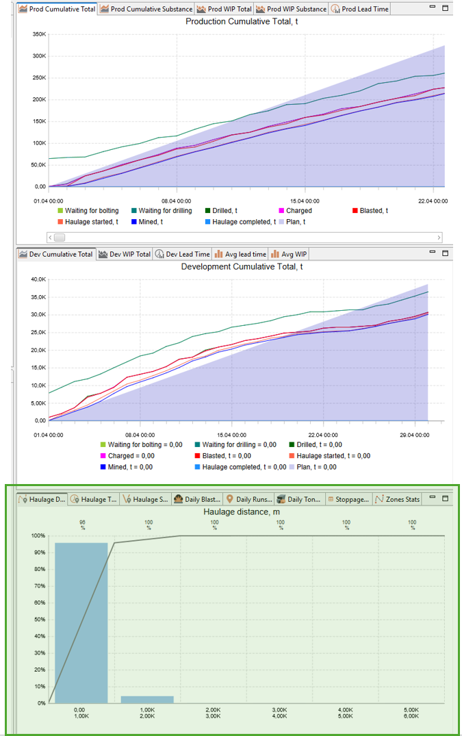
In the bottom-right window, several additional charts and tables are available, primarily focused on ore transportation statistics and other events.
Haulage Distance Chart
The Haulage Distance chart shows the distribution of haulage trip lengths (in meters) for all transportation runs completed during the simulation.
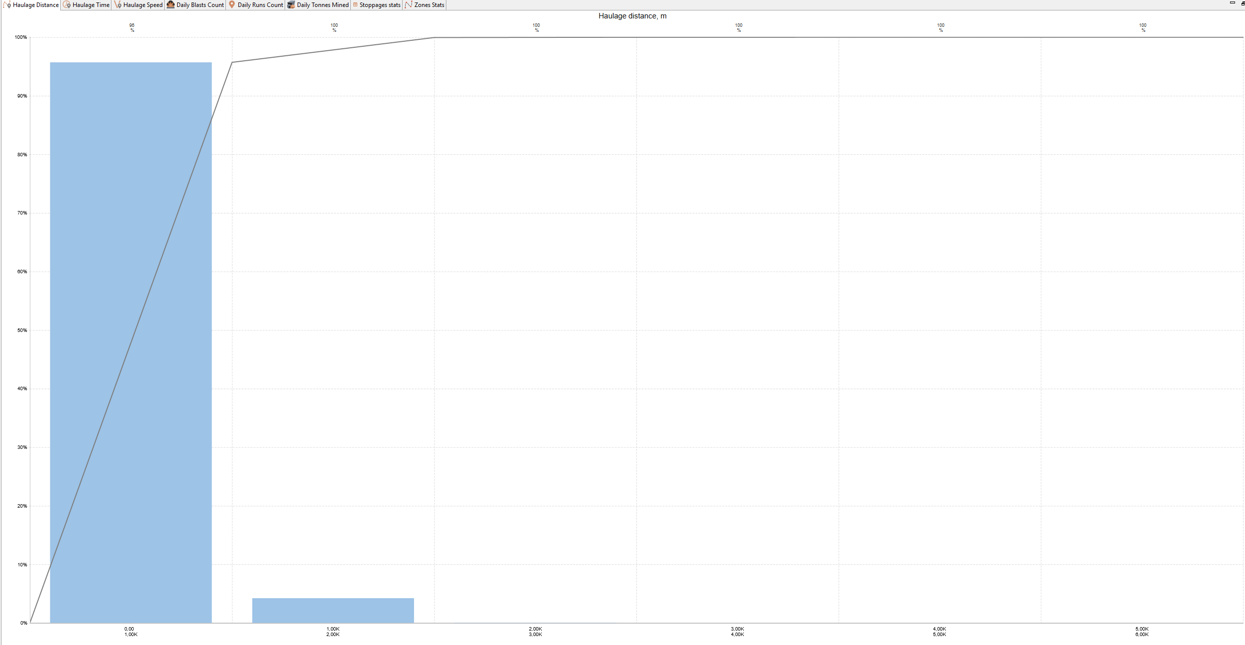
This chart helps analyze how far trucks or LHDs are traveling on average, identify typical haulage distances, and detect excessively long or inefficient routes that may reduce productivity.
Chart Elements:
-
X-axis (horizontal): Haulage distance intervals (m)
-
Y-axis (left vertical): Percentage of total trips in each distance interval
-
Y-axis (right vertical, cumulative line): Cumulative percentage of all trips
Chart Components:
-
Blue bars — show the share of trips within each distance interval (histogram)
-
Gray cumulative line — shows the cumulative percentage of all trips as distance increases
-
Labels above bars — show the exact cumulative percentage of all trips up to the current bin
How to Use:
-
Identify most common haulage distances — these appear as peaks in the histogram.
-
Analyze distribution balance — if most trips are clustered at very short or very long distances, consider optimizing road layout or destination assignment.
-
Track long-distance trips — high shares of long-distance hauling can indicate potential bottlenecks or inefficient routing.
-
Use this chart together with Haulage Time and Haulage Speed charts to assess transport efficiency.
Haulage Time Chart
The Haulage Time chart shows the distribution of haulage trip durations (in minutes) for all transportation runs completed during the simulation.
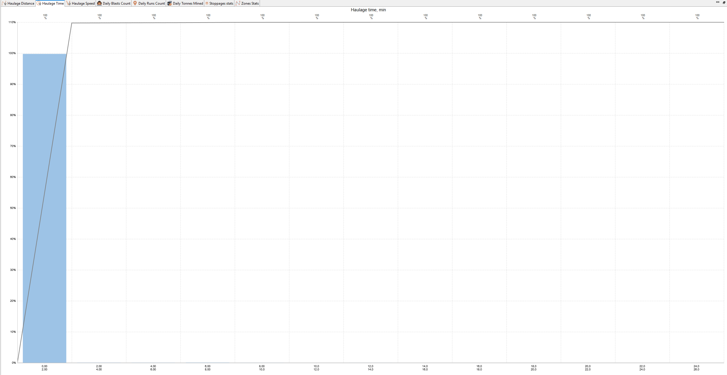
This chart helps evaluate the efficiency of haulage operations by showing how long typical transportation cycles take. It helps identify unusually long or short trips, as well as detect delays that reduce fleet productivity.
Chart Elements:
-
X-axis (horizontal): Haulage time intervals (minutes)
-
Y-axis (left vertical): Percentage of total trips in each time interval
-
Y-axis (right vertical, cumulative line): Cumulative percentage of all trips
Chart Components:
-
Blue bars — show the share of trips within each time interval (histogram)
-
Gray cumulative line — shows the cumulative percentage of all trips as time increases
-
Labels above bars — show the exact cumulative percentage of all trips up to the current bin
How to Use:
-
Identify most common haulage times — these appear as peaks in the histogram.
-
Detect abnormally long haulage times that may indicate delays, congestion, or breakdowns.
-
Evaluate fleet performance stability — a tight distribution (narrow cluster of bars) indicates consistent operations, while a wide spread suggests unstable performance.
-
Compare with the Haulage Distance and Haulage Speed charts to detect whether long times are due to longer routes or lower travel speeds.
Haulage Speed Chart
The Haulage Speed chart shows the distribution of average travel speeds (in kilometers per hour) achieved during all haulage trips completed in the simulation.
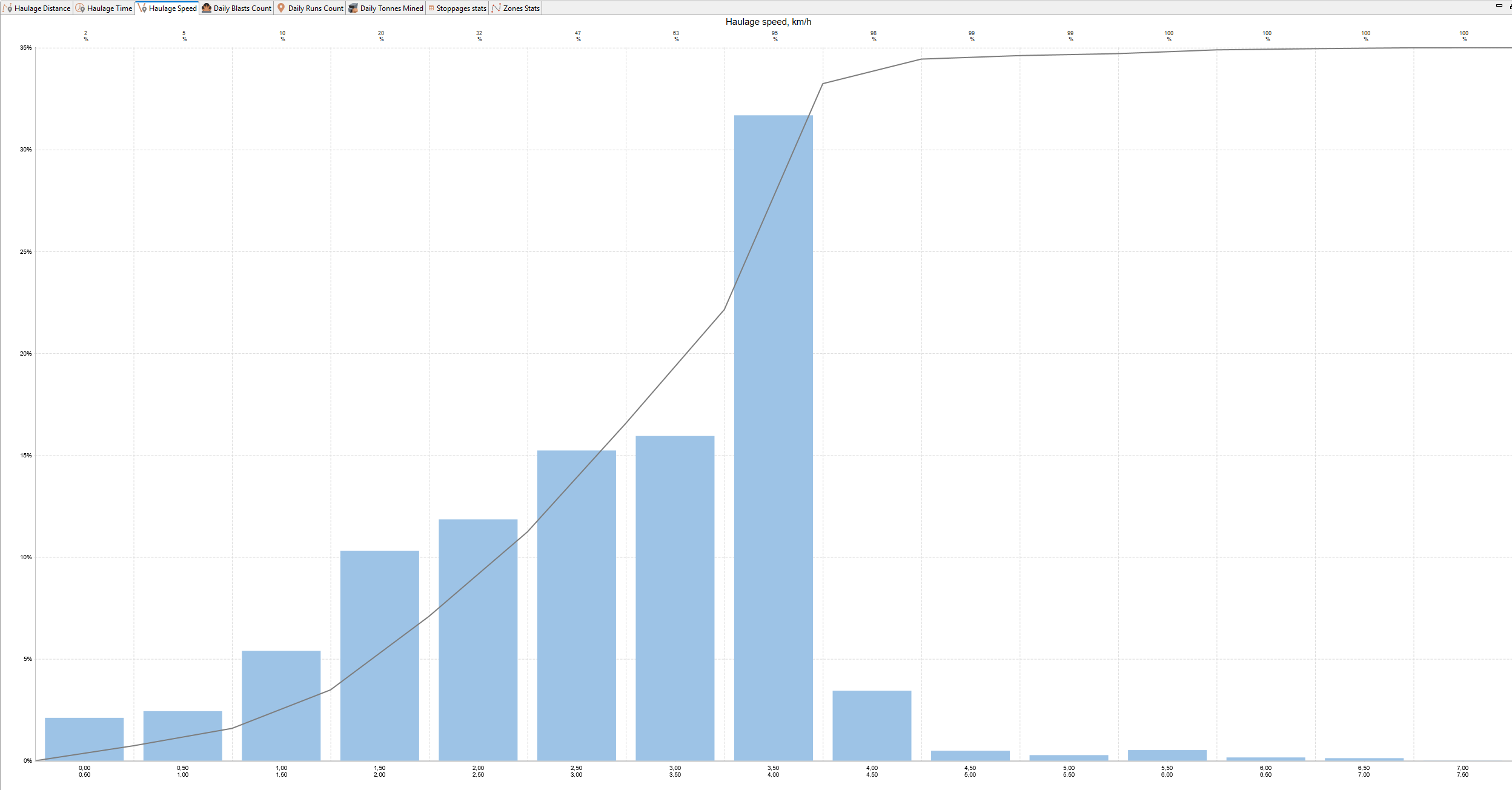
This chart helps evaluate the efficiency of haulage operations by showing how fast equipment moves on average, and it helps detect cases where low speeds may indicate congestion, steep gradients, poor road conditions, or mechanical issues.
Chart Elements:
-
X-axis (horizontal): Haulage speed intervals (km/h)
-
Y-axis (left vertical): Percentage of total trips in each speed interval
-
Y-axis (right vertical, cumulative line): Cumulative percentage of all trips
Chart Components:
-
Blue bars — show the share of trips within each average speed range (histogram)
-
Gray cumulative line — shows the cumulative percentage of all trips as speed increases
-
Labels above bars — show the exact cumulative percentage of all trips up to the current bin
How to Use:
-
Identify most common travel speeds — these appear as peaks in the histogram.
-
Detect low average speeds, which may indicate poor road conditions, queues or delays caused by traffic congestion.
-
Evaluate speed consistency — a narrow cluster of speeds means stable performance, while a wide spread indicates variation between trips.
-
Use together with Haulage Time and Haulage Distance charts to understand whether long travel times are caused by longer distances or lower speeds.
Daily Blasts Count Chart
The Daily Blasted Blocks Count chart shows the distribution of the number of blocks blasted per day during the simulation period.
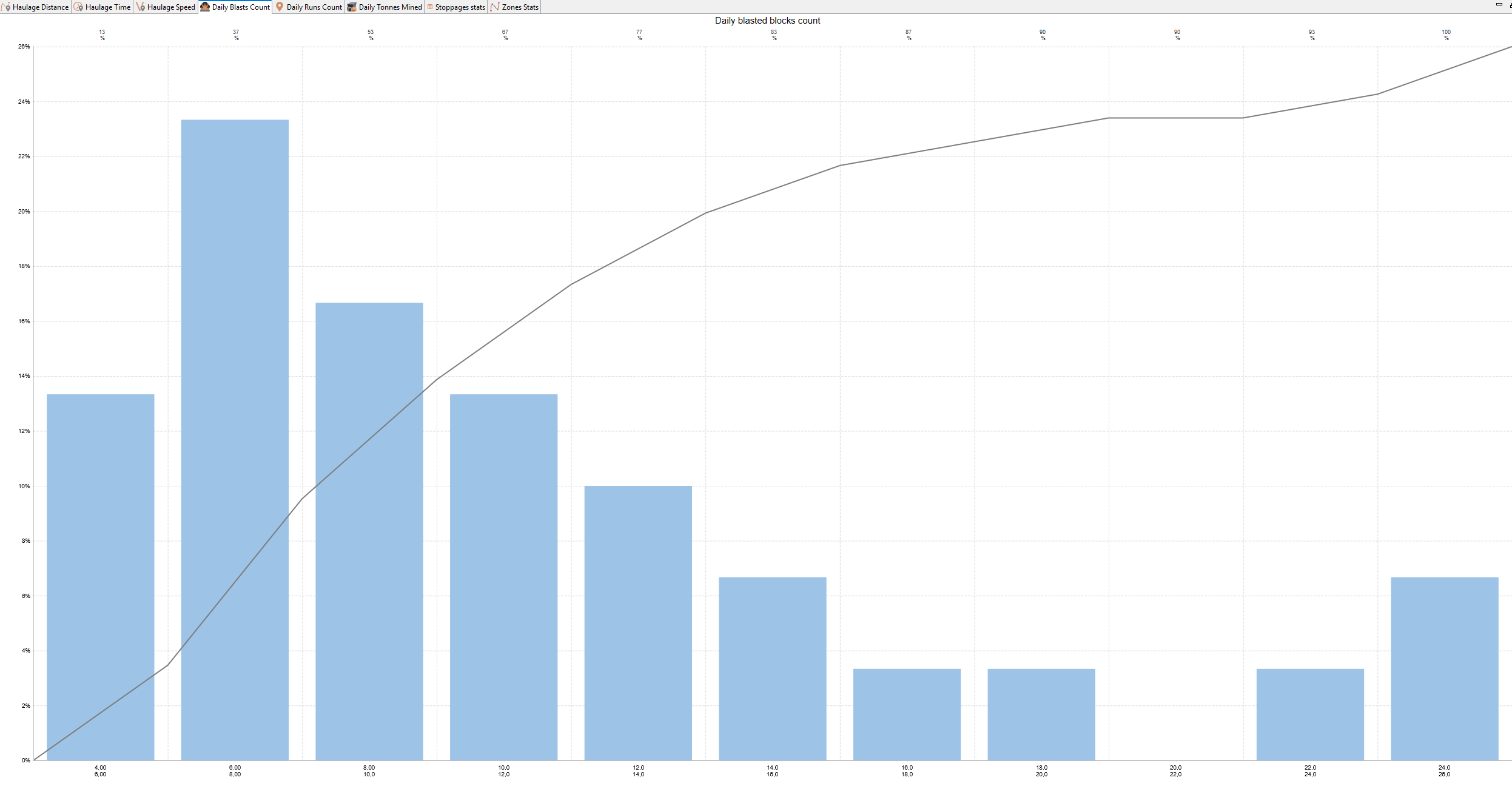
This chart helps evaluate the intensity and regularity of blasting operations. It indicates how often blasting events occur and whether they are concentrated in large batches or evenly spread out over time.
Chart Elements:
-
X-axis (horizontal): Number of blasted blocks per day
-
Y-axis (left vertical): Percentage of simulation days that had this number of blasted blocks
-
Y-axis (right vertical, cumulative line): Cumulative percentage of all days that had this number of blasts or fewer
Chart Components:
-
Blue bars — show the share of days that had the specified number of blasted blocks
-
Gray cumulative line — shows the cumulative percentage of all days that had this or fewer number of blasts
-
Labels above bars — show the exact cumulative percentage of all days that had this or fewer number of blasts
How to Use:
-
Identify typical blasting frequency — shown by the highest bar.
-
Detect bursty vs. steady blasting:
-
A single tall bar near zero means blasting happens infrequently.
-
A wider spread of bars means more consistent daily blasting.
-
-
Use this chart alongside Daily Runs Count and Daily Tonnes Mined charts to see how blasting activity influences production cycles.
Daily Runs Count Chart
The Daily Runs Count chart shows the distribution of the number of loaded haulage runs (trips with ore or waste) completed per day during the simulation period.
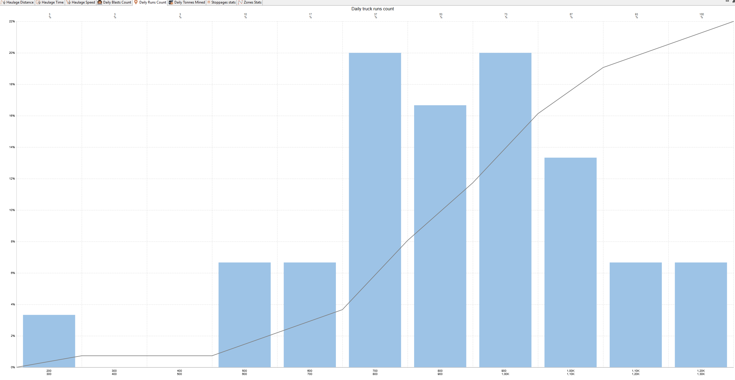
This chart helps analyze the intensity and consistency of haulage operations. It shows how many loaded trips are typically performed in a day and highlights whether hauling activity is steady or highly variable.
Chart Elements:
-
X-axis (horizontal): Number of loaded runs per day
-
Y-axis (left vertical): Percentage of simulation days that had this number of loaded runs
-
Y-axis (right vertical, cumulative line): Cumulative percentage of all days that had this number of runs or fewer
Chart Components:
-
Blue bars — show the share of days that had the specified number of loaded runs
-
Gray cumulative line — shows the cumulative percentage of all days that had this or fewer number runs
-
Labels above bars — show the exact cumulative percentage of days that had this or fewer number runs
How to Use:
-
Identify the most common daily workload for haul trucks or LHDs (the tallest bar).
-
Detect uneven hauling performance — a wide spread of bars indicates large fluctuations in daily output.
-
Spot low-activity days — tall bars near zero show days with little or no hauling.
-
Use this chart alongside the Daily Blasted Blocks Count and Daily Tonnes Mined charts to see how hauling activity aligns with blasting and production cycles.
Daily Tonnes Mined Chart
The Daily Tonnes Mined chart shows the distribution of the total amount of ore mass (in tonnes) considered as mined per day during the simulation period.
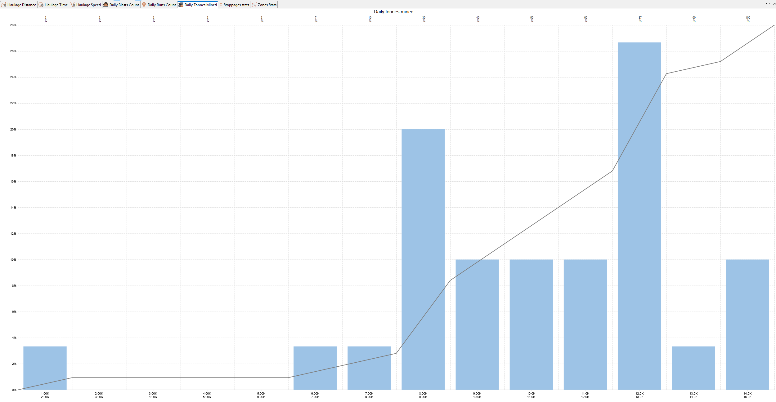
This chart helps evaluate the daily production performance of the mining operation. It shows how much ore mass is typically considered as mined in a day and whether production rates are stable or vary significantly between days.
Chart Elements:
-
X-axis (horizontal): Total mined tonnage per day
-
Y-axis (left vertical): Percentage of simulation days that had this amount of mined material
-
Y-axis (right vertical, cumulative line): Cumulative percentage of all days that had this amount or less
Chart Components:
-
Blue bars — show the share of days that had the specified daily mined tonnage
-
Gray cumulative line — shows the cumulative percentage of all days as the mined tonnage increases
-
Labels above bars — show the exact cumulative percentage of days up to the current bin
How to Use:
-
Identify the typical daily production output — the tallest bar shows the most common production level.
-
Detect low-production days — tall bars near zero may indicate downtime or operational disruptions.
-
Check consistency of output — a narrow cluster of bars shows stable production; a wide spread indicates fluctuating performance.
-
Use this chart alongside Daily Runs Count and Daily Blasted Blocks Count charts to understand how production aligns with hauling and blasting activity.
Note: In all histograms, the left boundary of each range is inclusive, while the right boundary is exclusive. This means that, for example, in the 0–1 range (with an integer number of blasts), only days with 0 blasts will be included.
Stoppage Stats Table
The Stoppage Stats table summarizes all downtime events that occurred during the simulation, grouped by equipment type and stoppage typen. It provides an overview of how much time equipment spent unavailable due to scheduled or unplanned stoppages.
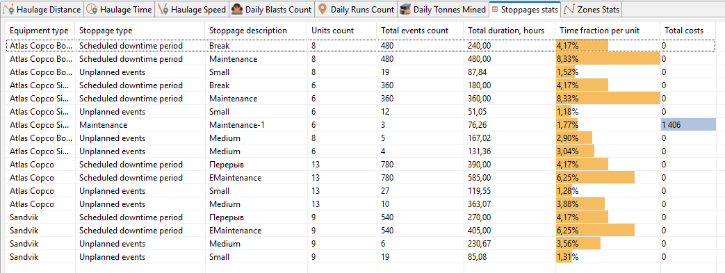
This table helps analyze the impact of various downtime reasons (such as weather, maintenance, or blasting) on equipment availability and productivity.
Table Columns:
-
Equipment type — the type or model of equipment affected by the stoppages
-
Stoppage type — the category of downtime
-
Stoppage description — the specific name of the stoppage (for example, Blast 1 or Meteo)
-
Units count — the number of equipment units of this type that experienced this stoppage
-
Total events count — the total number of stoppage events of this type that occurred during the simulation
-
Total duration, hours — total time (in hours) that equipment was unavailable due to this stoppage
-
Time fraction per unit — share of total scheduled operational time that each affected unit spent in this stoppage state (shown as a percentage)
-
Total costs — total costs associated with this stoppage (if cost parameters are configured)
How to Use:
-
Identify which types of stoppages cause the largest downtime (look at Total duration, hours and Time fraction per unit).
-
Distinguish between planned and unplanned stoppages to assess operational reliability.
-
Use this data to refine schedules (e.g., plan maintenance better or reduce weather exposure) and improve equipment availability.
-
If cost tracking is enabled, compare downtime-related costs across equipment types.
Zone Stats Table
The Zone Stats table provides a breakdown of transportation performance indicators by zone. Zones are user-defined areas of the haulage network, used to group road segments (arcs) for analysis.

This table helps evaluate the efficiency of haulage operations within different parts of the mine by comparing travel distances, speeds, and transported volumes across zones.
Table Columns:
-
Zone — the name of the zone assigned to road segments (or (none) if not assigned)
-
Total length, km — the total combined length of all segments within this zone
-
Avg. loaded speed, kph — the average speed of equipment moving with a load inside this zone
-
Avg. empty speed, kph — the average speed of equipment moving without a load inside this zone
-
Total haulage, t*km — the total haulage work performed in this zone, measured as tonnes transported × kilometers traveled
How to Use:
-
Identify zones with high haulage workload — large values in Total haulage, t*km indicate areas where most transport effort is concentrated.
-
Analyze travel speed differences between zones to detect possible bottlenecks (low speeds may signal steep gradients, congestion, or poor road conditions).
-
Evaluate zone coverage — check Total length to see which areas dominate the road network.
-
Use this data to optimize traffic organization and road maintenance priorities.
By pressing the button  in the top toolbar, cumulative graphs are synchronized with the schedule.
Availability and utilization calculation
Understanding equipment availability and utilization is crucial for optimizing mining operations and minimizing downtime. MineTwin’s simulation tool provides a clear framework to track key metrics like total time, scheduled time, and utilized time, helping identify inefficiencies and improve equipment performance. These insights support better understanding of simulation results.
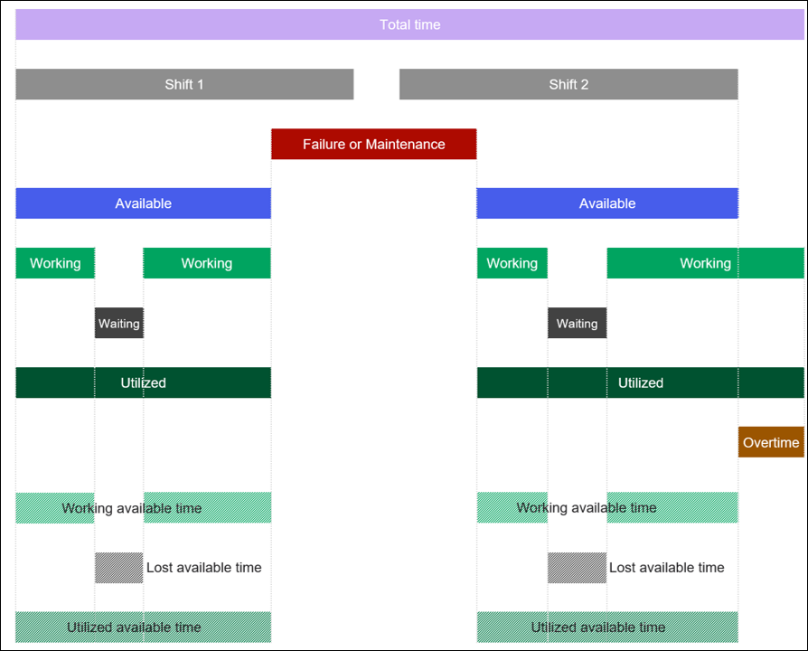
On the scheme above, there are the following categories of time periods and time usage:

Total time – total time since the beginning of the simulation.

Scheduled time – time there was a shift scheduled for the equipment. For equipment without shifts, scheduled time = total simulation time or total time between commissioning and decommissioning, if these are specified for this equipment.

Unavailable time – duration of slots classified as UNAVAILABLE. Typically, failures and maintenances fall into this category.
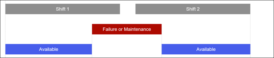
Available time is calculated as scheduled time excluding unavailable time.

Working time – duration of slots classified as ACTUAL_WORKING, doing actual useful work. For example, for trucks it would include moving to loading location, loading, moving loaded to unloading location, and unloading

Lost time (also can be called Waiting time) – duration of slots classified as LOST_TIME, waiting for something or being blocked. For example, for trucks it would include waiting in front of an unloading point or queuing in front of an loader.
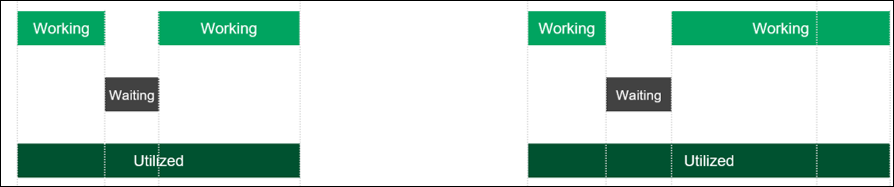
Utilized time is calculated as working time united with lost time.
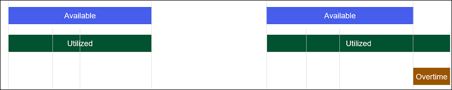
Overtime is calculated as utilized time excluding available time, should be negligibly small in real scenarios.

Working available time is calculated as working time intersected with available time.

Lost available time is calculated as lost time intersected with available time.

Utilized available time is calculated as utilized time intersected with available time.
The above time usage categories are used to calculate availability, utilization, effective utilization, and lost time fraction for individual equipment units and groups:
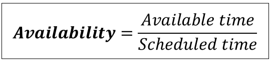
Availability is calculated as a fraction of scheduled time when the equipment was available:
Utilization is calculated as a fraction of available time when the equipment was utilized (e.g. either working or actively waiting for something):

Effective utilization is calculated as a fraction of available time when the equipment was working (i.e., doing the useful work):

Lost time fraction is calculated as a fraction of utilized available time when the equipment was actively waiting for something or was otherwise blocked:
